River Campus Libraries at University of Rochester
Enhancing digital visibility of library spaces to help students, staff, and faculty make the most of physical environments
Role: Digital Media Intern, UX Designer and Researcher
Tasks: Competitive analysis, heuristic evaluation, empathy interviews, survey, usability tests, prototype
Duration: 8 weeks (June - August 2023)
Tools: Figma, Qualtrics, Miro, Zoom, Google Sheets, RStudio
Context
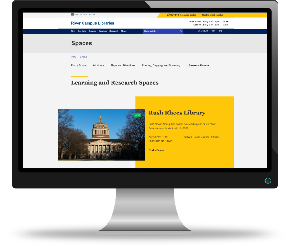
In early 2020, the University of Rochester River Campus Libraries website launched a redesigned Spaces page, aiming to connect students with study areas, collaboration spaces, and room reservations tools. However, the redesign failed to effectively bridge the gap between the library’s digital interface and physical presence, falling short of its intended purpose.
Approach
To address these shortcomings, I conducted a comprehensive competitive audit and user research to uncover key pain points and unmet needs among students and staff. Insights from this process informed a redesigned interface that is fully responsive across desktop and mobile platforms. The final design aligns with the library’s existing UI and the university’s brand guidelines, delivering a more seamless, intuitive, and user-centered experience.
01
Research
Goal: Determine who the users are and what their needs look like; understand how other universities approach the same problem
Process: Competitive analysis, heuristic evaluation, survey, interviews
Heuristic Evaluation
I conducted a heuristic evaluation of the current website to identify the key issues, categorized by severity and ease of resolution. I found eight problem areas and three successful aspects along with five recommendations based on the usability heuristics. The most common issue was related to consistency and standards, indicating a need for more standardized content.
Competitive Analysis
I conducted a comparative analysis of ten university library websites to examine how peer institutions addressed similar challenges, organizing key findings into structured tables for clarity and insight.
Survey
I developed a survey regarding student use of library spaces in Qualtrics and analyzed it in Google Sheets and RStudio. The survey received 223 responses from current students, recent graduates, and graduate students and was open for a week and a half.
Interviews
I conducted eight empathy interviews to gain insights into students' needs and perceptions regarding library spaces and their usage. In addition, I conducted five informal staff interviews with student-facing staff to understand their needs and their perspective on student needs, focusing on library spaces and the current Spaces page on the library website.
Initial Insights
Clarifying the difference between libraries and spaces:
The current website's Spaces page, which does not clearly differentiate between libraries and library spaces, is the only way to access library collections, causing staff difficulties in navigating to specific library webpages.
Reorganizing to reflect the hierarchy of River Campus Libraries:
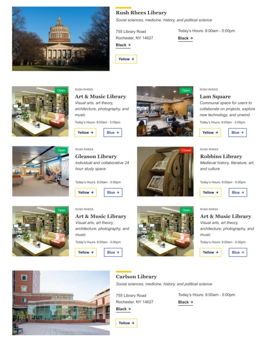
Given that the River Campus Libraries include six libraries, with three located within the physical Rush Rhees library building, it’s essential to clearly represent this hierarchical structure on the webpage.
Addressing inconsistent information
There is inconsistent information on the individual library pages; each page should include contact information (email, phone number, address, staff), a map (floor plan/campus map as applicable), collections, and hours.
02
Define
Goal: Define and understand users’ needs and mindset with regard to physical library spaces and the library website
Process: Survey analysis, interview analysis, affinity diagram, data visualizations
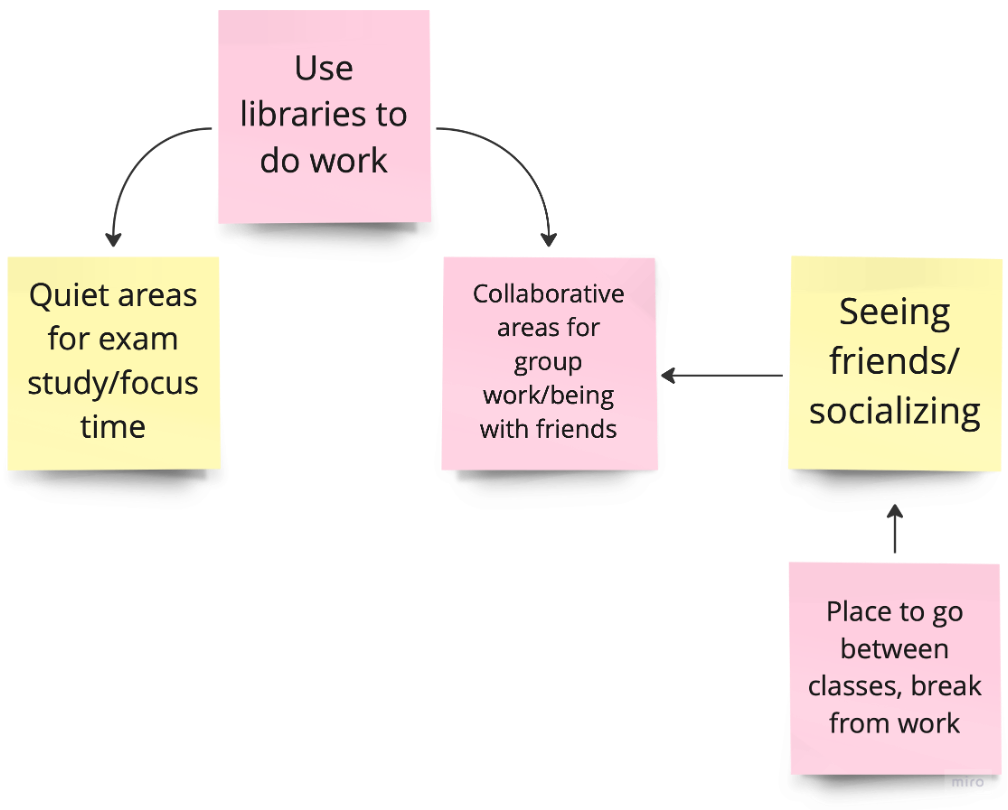
Using data visualizations and affinity diagrams, I was able to distill the survey and interview findings into critical insights.
Major Findings
Students find crowdedness, followed by hours and noise level, to be most important when choosing study spaces
Around a third of students knew a Spaces page currently exists
Those who have used the page primarily use it for reserving (60%) and browsing spaces (32%)
Beyond specific resources and programming, students use the library for focused studying, socialization, and group work which each require different sets of needs:
Focused Studying
Students have more strict atmospheric needs that create a conducive environment for concentration-required work; the degree of preference and the particular needs vary between individuals
Socialization
Students have fewer atmospheric needs; they look for spaces that maintain an appropriate noise level, so they are able to speak comfortably; they consider the library as a third space
Group Work
Students have fewer atmospheric needs; they tend to seek reservable or collaborative spaces
“Atmospheric needs” refer to space-dependent factors such as type of seating/tables, lighting, group/individual study spaces, and access to outlets.
Defining Needs and Page Use
Who are they?
How will they use this page?
Primary Users
Browsing spaces fit for their needs, reserving spaces, finding hours and directions
Undergraduate students
Secondary Users
Staff, faculty, graduate students, community members, prospective students and families
Searching for specific libraries and their collections, finding hours, browsing spaces to learn more about the library
03
Ideate and Design
Goal: Translate user’s needs into actionable insights to inform design choices
Process: Develop data-based actionable insights, wireframes
After gaining a deeper understanding of the target audience and their website usage, I was able to translate these insights into action.
Insights
Action
Students don’t prioritize reservable spaces when searching for spaces to do work in, but they use the website to reserve spaces
Make the “reserve a space” button easy to find to short-cut
Students want to know what amenities are available
Allow filtering for spaces by features and resources
When not studying, students use the library as a neutral third place to find people, socialize, and rest between classes
Promote collaborative spaces at the library that can be used for purposes beyond workspaces
Staff is frustrated about differentiating study spaces from libraries that hold collections
Develop two distinct pages to highlight the libraries (and their resources) separately from study spaces
Wireframes
These sketches of the Spaces and Find a Space pages were instrumental in shaping the basic layouts, determining the optimal inclusion of essential, and establishing the visual hierarchy.
04
Prototype
Goal: Develop functional models of the proposed design
Process: Mockups, prototypes
Mockups
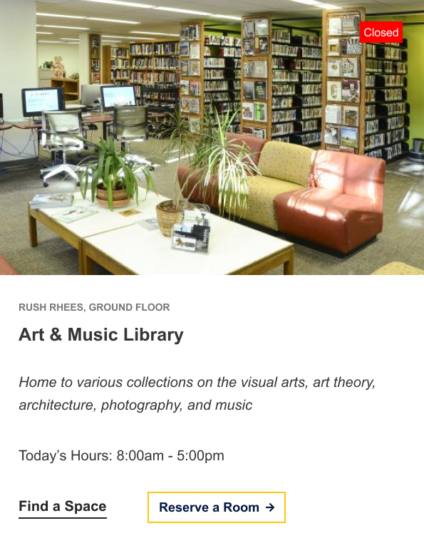
I began developing mid-fidelity mockups, skipping direct digitization of the sketches to instead focus on populating the cards with content specific to each location.
I drew inspiration from existing card designs in the University of Rochester component library and the library website, creating a new version that met the page’s needs.
Prototypes
After rounds of iterations to narrow down the design, I compiled recommendations from the research and ideation stages to develop the following prototype of the Spaces and Find a Space pages.
05
Iterate
Goal: Test the prototype to discover areas for usability and visual improvements
Process: Usability testing, reference document
Usability Testing
I developed five realistic scenarios for users to complete tasks using the prototype to assess the design. Participants answered preliminary and post-testing questions, and I gathered their general feedback on the pages as well.
I synthesized the key themes and findings into a comprehensive analysis of the testing, including highlights, areas for improvement, and usability issues, categorized by type and severity, along with proposed solutions for each.
Highlights
Helpful for a first year or students who are learning about the spaces available in the library
Includes less common spaces
Includes basic information, features, photo, and the “perks” of places; can see everything each space has to offer
Easy to reserve a room directly from Find a Space page; takes fewer clicks to reserve a space than in the past
Easy to use filters; can break down features if you have certain needs
Places for Improvement
Difficulty finding directions
Didn’t know to click on card to show more features
Difficulty noticing noise level icon
Difficulty noticing filters
Accidentally clicking on other links on card instead of clicking to flip
Should be able to access Find a Space page more easily from homepage
Reference Document
To finalize my contribution, I developed a reference document detailing each step of the process and the resulting insights. The document includes 5 usability edits to the Spaces page, 19 usability edits to the Find a Space page, 9 overall website recommendations, 8 recommendations for improvements to student library experiences, and 4 general recommendations for future projects. These recommendations are based on survey, interview, and usability testing data, with many ideas linking to the physical library experience.
06
Takeaways
Spend more time defining.
Following the interviews and survey, I jumped headfirst into design. In hindsight, I wish I had spent more time defining user thoughts and actions prior to tackling the layout. I found numerous opportunities for improvement based on the competitive analysis alone, which led me to prioritize those changes over developing empathy maps and user/task flows until later in the process.
Explore the interconnectedness between physical and digital spaces.
I enjoyed taking a look at users’ physical space needs and how that can be reflected in website design. Moving forward, I look forward to further investigating the built environment and deepening my understanding how and why spaces are developed.
Make use of wireframes and low-fi mockups.
Given the varying amounts of information across spaces, I populated the page with content early on to ensure everything fit comfortably. While this approach helped with layout, it made subsequent adjustments more challenging. In the future, I plan to spend more time on low-fidelity mockups to confirm that the layout meets functional requirements before refining the details.
Next Steps
With additional time, I would implement the suggested edits and conduct another round of usability testing. I would like to broaden the scope of this project to enhance website functionality by better connecting spaces, events and exhibits, and resources. I hope the library continues to prioritize student needs and act on feedback in the future.
A special thank you to my supervisor Sue Gleason as well as Vini Romualdo, Yasmin Mattox, Matt Cook, and Claudia Pietrzak who all served as incredible resources throughout the project. Thank you to Kim Hoffman, Claire Pitcairn, and Kevin Garewal for developing and leading the internship program and to Barbara Burger for making this program happen.


